
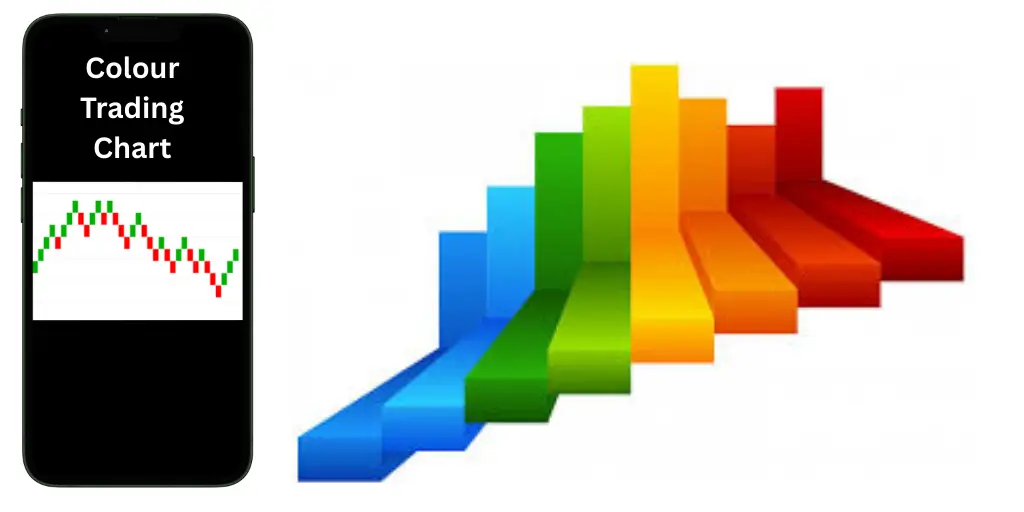
Trading is one of the greatest skills; when you are facing numbers and charts, it gets really handy. This is where colour trading charts help you out. These charts highlight price appreciation, depreciation, and constancy using different colours. Like, green could indicate an increase in price and red, a decrease. Traders do not have to read so much data to get some idea about the market.
Colour charts will make you feel confident and comfortable, whether you are a newcomer or an experienced trader, leading to faster and better decision-making. In this article, we will be explaining what colour trading charts are, how they work and how they can help you to trade smarter. So let’s get started and explore more about colour trading charts!
Contents
What are colour trading charts?
Colour trading charts are visual representations of the market using colours. These are not just figures. These charts use colours to make sense of them, like green and red. Green generally indicates the price is climbing, while red means the price is declining. They clear up whether the market is good or bad very quickly for everyone. This simplifies the decision of whether to buy or sell.
Colour charts are really helpful, and particularly for new traders, because you don’t need to be an expert to read them. You just look at the colours and you have a good sense of what’s happening.
How do colour trading charts work?
Where are the common terms that you should know before starting colour trading:
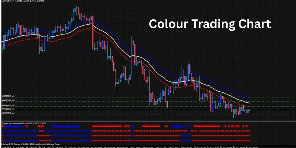
1. Candlestick Format: Candlesticks are commonly used in colour trading charts to track price movements. A candle represents the open, close, high, and low price during a selected period. The body and wick of the candle clearly describe how the price moved, making it easier for traders to identify trends without developers having to analyze raw data.
2. Colour coding: They use colours to indicate if the price has risen or fallen. A green candle usually means that the price rose (a bullish) while a red means that it fell (a bear). That colour difference enables traders to scan the chart and instantly see the direction of the market without having to get into deep technical analysis.
3. Time Frame Selection: The Colour trading charts cater to different time frames 1-minute, 15-minute, hourly or daily. Depending on their strategy, traders use certain time frames. The amount of time the candle covers can be adjusted so that each candle reflects the price action within the period you choose, which is helpful for both short- and long-term traders.
4. Identifying Market Trends: Traders can easily identify a trend by viewing a series of candles. Also, a series of green candles could signify an uptrend while a series of red candles could suggest a downtrend. Identifying trends allows traders to determine at which point they can enter or exit a trade to maximize their chances of profit.
5. Resistance & Support Levels: The colour charts will help to spot support (price floor) and resistance (price ceiling) levels. These areas where price changes direction multiple times are high and low points that get marked and monitored. This also means that the traders behind the charts will have real levels to go off, instead of random numbers pulled from thin air, which gives them much more confidence when planning reversals/breakouts.
6. Volume & Strength Indicators: Colour trading charts also feature colour-coded volume bars. These bars indicate the volume of trades that occurred within a candle. Low volume reflects weak interest or uncertainty while a high volume with candle colour strength (dark green/red) indicates a strong market movement.
7. Technical Tools Integration: Just like other indicators such as Moving Averages or Relative Strength Index (RSI), your colour trading charts frequently use colour-coded indicators. These tools give additional signals for trend strength and entry or exit points. However, the use of visual colours with technical tools enables traders to make quicker, informed decisions.
Benefits & Drawbacks of Colour Trading Chart
Here are the benefits and drawbacks of colour trading chart explained below:
Benefits
- Simplifies Market Trends: Colour trading charts allow you to quickly see how and when to place your trades by simply reading the colours.
- Quick Decision-Making: Traders can decide to buy/sell faster without much of a detailed analysis of the technical indicators as the buy/sell signals are clearly marked but by the colour change.
- Reduces Information Overload: Color charts, unlike complex indicators, show simplified data colour-coded, allowing traders to stay focused and stick to the bare essentials.
- Enhances Pattern Recognition: Using colour-coded charts over a series of days enables traders to quickly see patterns such as trends, reversals, or consolidations, which aids in entering and exiting trades promptly.
Drawbacks
- Over-Simplification Risk: Using color as your sole decision mechanism can overlook more substantive technical elements resulting in poorly informed trades.
- Not Best for Advanced Strategies: For traders who employ complex strategies, colour charts might seem insufficient, as the amount of information contained in a chart based on colour sequences is smaller than that of traditional candlestick or indicator-based charts.
- May Mislead in Volatile Markets: With increased volatility, the colours will shift frequently; this may confuse traders who will act more emotionally and not strategically.
Conclusion
Colour Trading is online trading reduced to colours. You predict where the candle will end, within specific timeframes and based on the colours of the candles. It is simple and low barrier to entry, and produces results in no time, making it popular among novices as well as those with experience. If you’re just casually exploring it or are considering a serious trading option, knowing the tools the platform provides you with can be the key to success.
Read also:
FAQs: Colour Trading Chart
1. How can I read the Colour Trading Chart?
A completed trade is represented as a row on the chart. You can use this data to notice patterns – what colours come up the most and in which order.
2. What is the significance of the Colour Trading Chart?
By pinpointing colour trends, breakouts, and patterns, enables you to make smarter predictions when placing the right bet.
3. Does the Colour Trading Chart assure a win?
No chart can guarantee a win. The Colour Trading chart improves your odds click once more based on data trends, but at the end of the day it’s still a game of odds.